- Home
- >
- News
- >
- Company News
- >
- What kind of bus seat is a good design?
What kind of bus seat is a good design?
Netizens' replies rule out minimalism
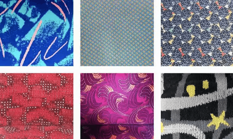
Seat design for public transport is not an easy task. Bus, train and subway seats not only must look attractive or attractive, they must also maintain a relatively clean appearance when used by many people on a daily basis.
To meet these conditions, public transport designers around the world have racked their brains. The most commonly used material is moquet, a woven suede blanket, which is far more fancy than clothes and curtains in pattern design.
The Instagram account “I Don’t Give a Seat” collects images of public transport seats from around the world. Account operator Julien Potart believes that people like his accounts because they relate to everyday life and offer a different perspective on public transport.
"The pattern on the bus seat is part of your everyday life," he explained. "Even if you don't look at it, it's something you'll sweep across, and it's easy to overlook. But you see them so often, they stick in your mind, and you can recognize it wherever you are."
Potart even did some small research on "why most seats are blue," which he believes comes from the fact that most people associate blue with safety, and it relieves the stress and anxiety that comes with traveling.
The CityLab website took to Twitter to solicit public transit seat designs that people around the world love. Based on the responses and data from accounts such as “I Don’t Give a Seat”, CityLab has come up with a set of criteria for a “good seat cover.”
It can be boiled down to four factors:
1. It is easy to be remembered. They need to be noticeable enough to be remembered at once.
2. Fresh and clean. The color of the suede needs to be bright enough to still look new after a few years of use without staining or fading too noticeable.
3. The pattern is slightly complicated and should not be too simple. The use of large areas of monochrome will make the wear and tear more conspicuous and make people more destructive.
4. Anti-dazzle. Suede should not be too shiny or too harsh.
Corresponding to these four factors, the cases collected by CityLab from netizens are divided into some design ideas.
1. Keep the tradition
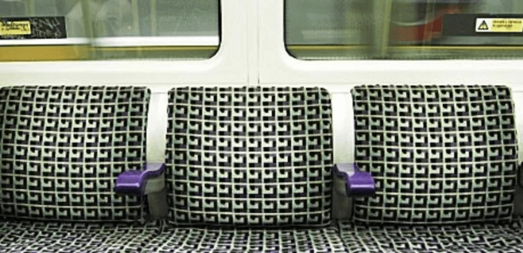
Some of the most iconic mass transit designs follow tradition. The fabric used on the London Underground and buses references the tartan pattern, which is sourced from Scotland. It's a perfect template choice that still allows for a variety of changes in a clear style. The subtlety of London seating is that they have become fashionable as an upholstery fabric.
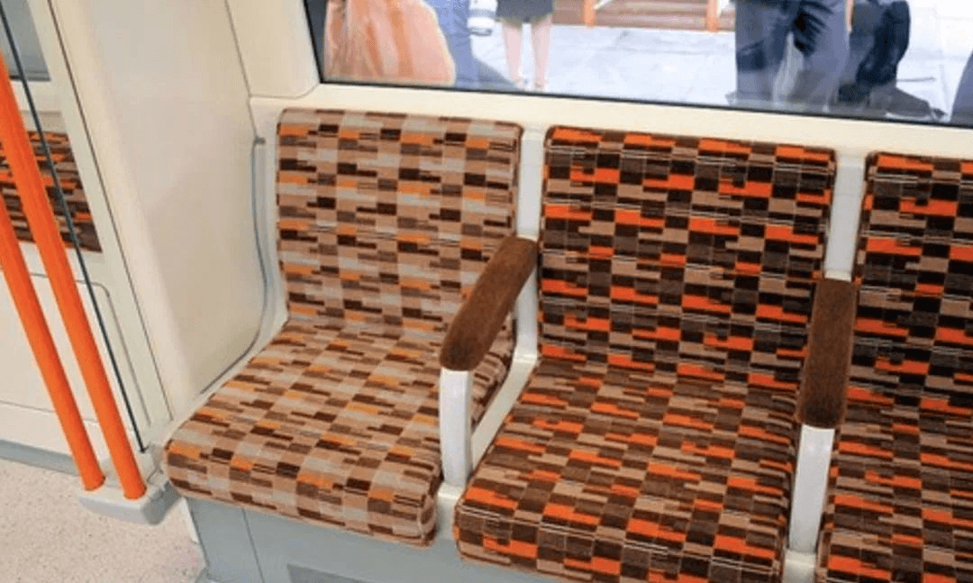
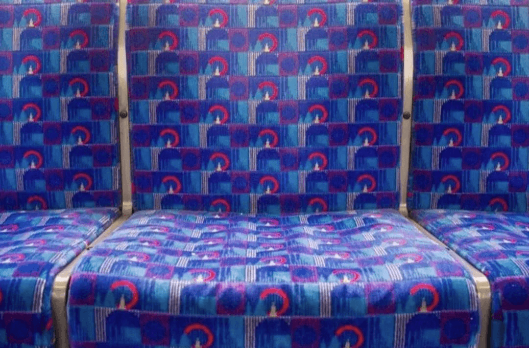
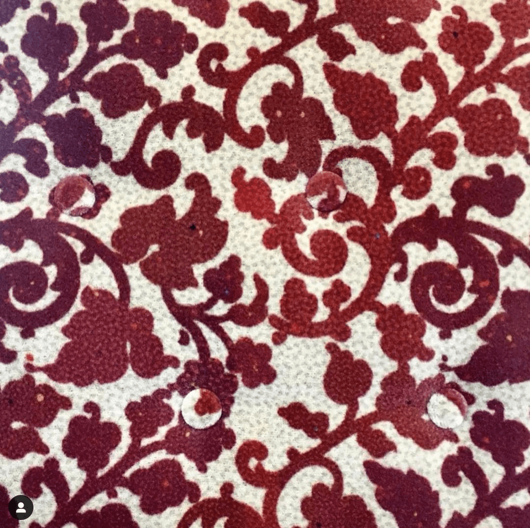
The Japanese Kinosaki train seat design uses the traditional flower pattern, but after clever changes, the seat is more wear-resistant. Originally, the white background was easy to be stained, but the light gray dots were evenly distributed in the white area, which broke the law of easy dirtiness in the monochrome area, so that the stains and the like were not easy to be seen.
Bus seat covers in the Krasnoyarsk Krai, Russia, also feature patterns commonly found on traditional Russian tapestries.
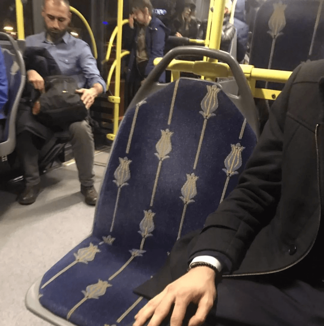
The national flower, the tulip, was chosen for the seat pattern on the Metrobus in Istanbul. In fact, the first tulip root in the Netherlands was imported from Constantine (present-day Turkey) by a Dutch merchant in 1593. The seats in Istanbul are made of eggshell and gray tulips, and the background is dark blue. Even if the back of the seat has white marks, it does not look abrupt.
2. Modern Abstraction
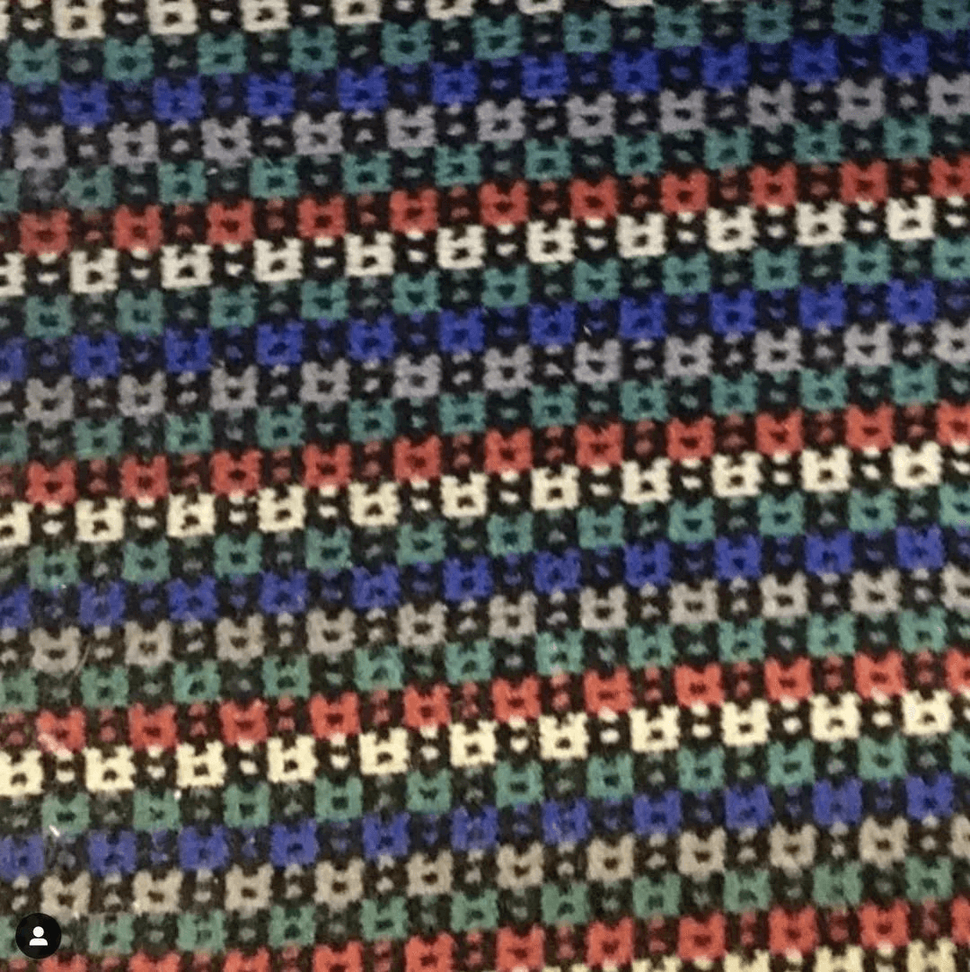
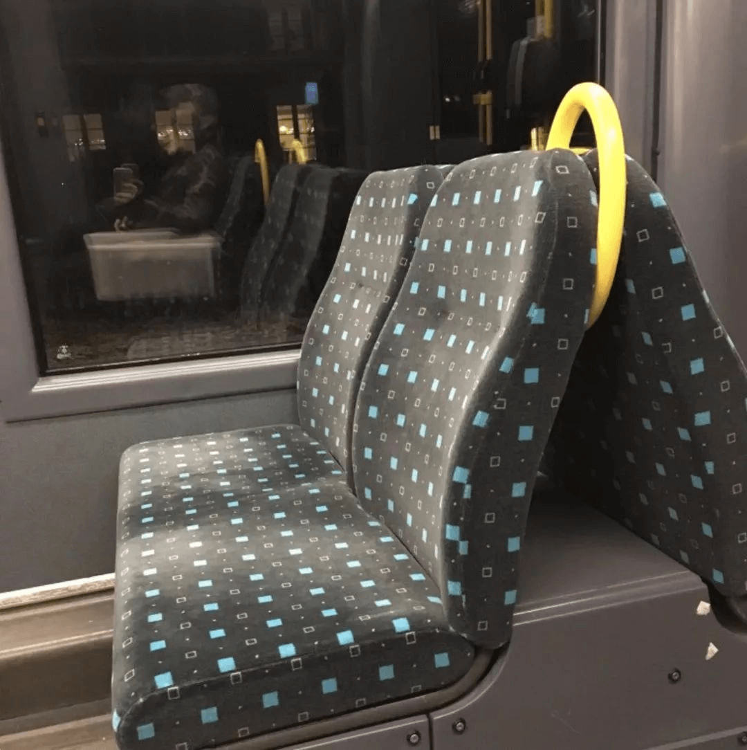
Some of the best suede seat cushions ditch tradition in favor of durable, eye-catching abstract prints. Take seat covers for the Oslo subway system, for example, they may not be as unique, but the low-saturated gray-green background color is durable. At the same time, the arrangement of the turquoise rectangles allows the fabric to look bright without creating unnecessary glare.
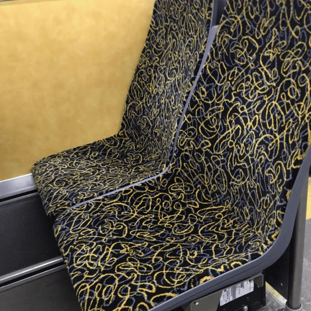
Pittsburgh's transit system seats are curvilinear graffiti in dark blue and bright yellow.
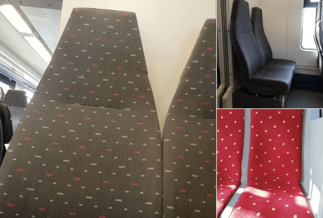
But modernist abstract designs can sometimes seem drab. For example, the colors and designs of Belgian train seats are dull and boring and uncharacteristic.
In response to passengers scribbling on the seats, BVG, the Berlin transport company, chose plastic seats and used irregular distorted patterns to avoid people's urge to graffiti. This also makes the BVG seat internationally recognizable.
The rest of the styles will be explained to you in the next article, please follow us for more interesting public transport knowledge.

