- Home
- >
- News
- >
- Company News
- >
- What kind of bus seat is a good design (2)?
What kind of bus seat is a good design (2)?
The previous article introduced you to some different styles of bus seat design styles. Now, let's take a look at what other styles are popular.
1. Psychedelic colors
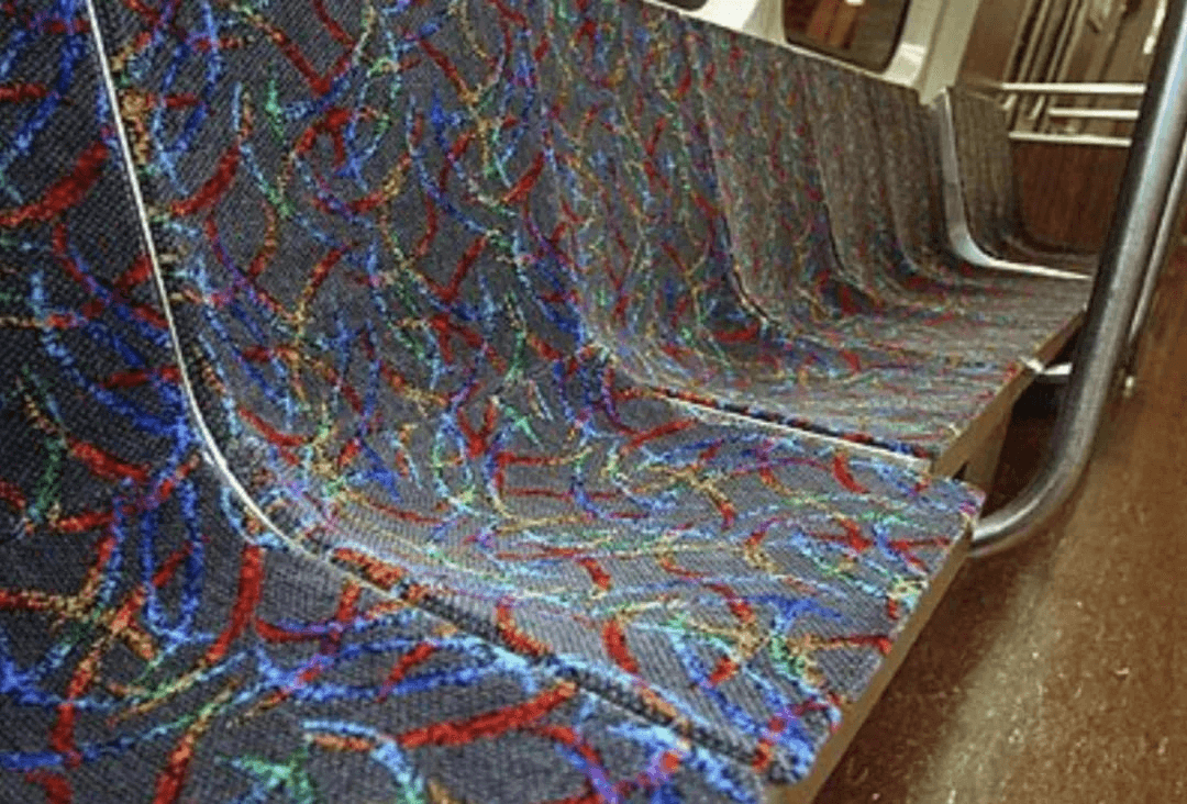
There are also many transit systems that eschew modernist abstract designs in favor of more prominent swirling patterns. For example, seat covers designed around the millennium tend to be overtly psychedelic. In this type of design, there are often swirls and spots (usually red and orange) that resemble the northern lights.
The advantage of these fabrics is that they make an immediate impression and stay bright for a long time. For example, Canberra's bus seats use at least 7 colors, but it's really psychedelic after watching it for a long time.
Boston's rainbow-colored arc style has been spit as "looks like a schematic diagram of a serial killer's brain neuron synapses."
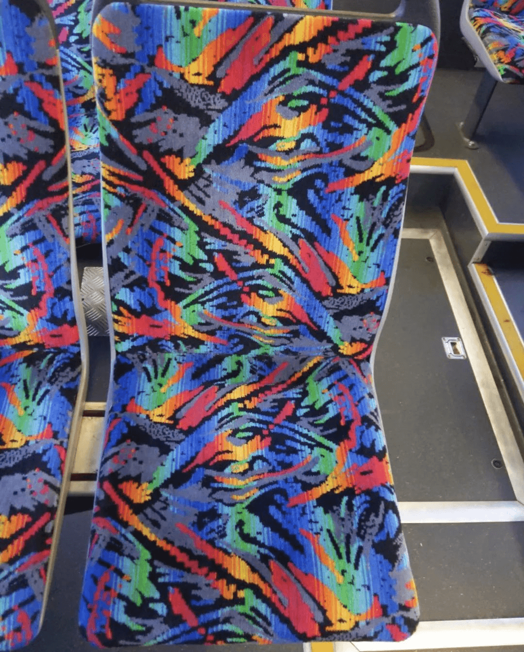
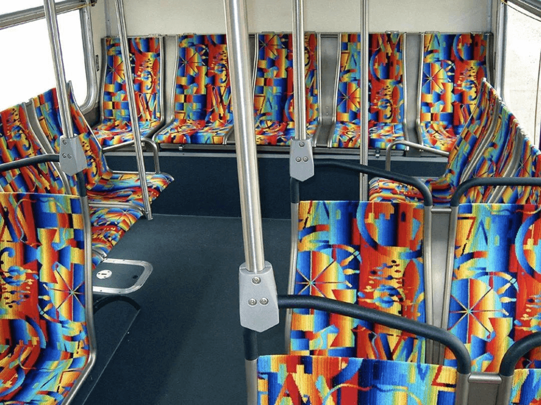
The psychedelic bus seats in Los Angeles, designed by artist Pae White and urban planner Tom Marble, are the state's first permanent art project for subways and buses.
The design of the seat is derived from some symbols of past vehicles (especially the 1930s and 1940s), while also preventing vandalism. Described on its website as "the latest and most futuristic design", while memorable, it seems to cause headaches over time.
2. Signs of meaning
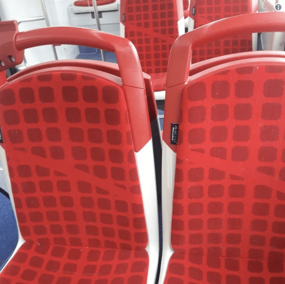
For a transportation system, if you want something instantly recognizable, it's common practice to include the city's distinctive character. That's the case with Barcelona's buses, whose seats have a grid pattern that resembles a map of the city's Eixample district, with the horizontal bisector being Barcelona's famous Diagonal Avenue.
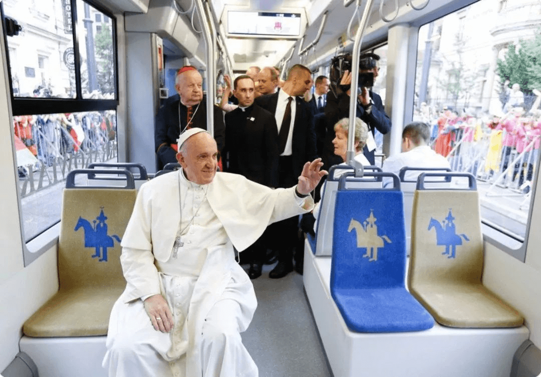
Lajkonik's silhouette is printed on the seats of a tram in Krakow, Poland. Lajkonik is an unofficial Krakow symbol for a bearded man with a pointed hat and Mongolian costume, with a wooden horse tied around his waist, resembling a Tatar, and is seen at the Lajkonik festival parade . The design feels fresh and comfortable, but the large monochromatic patches tend to smudge.
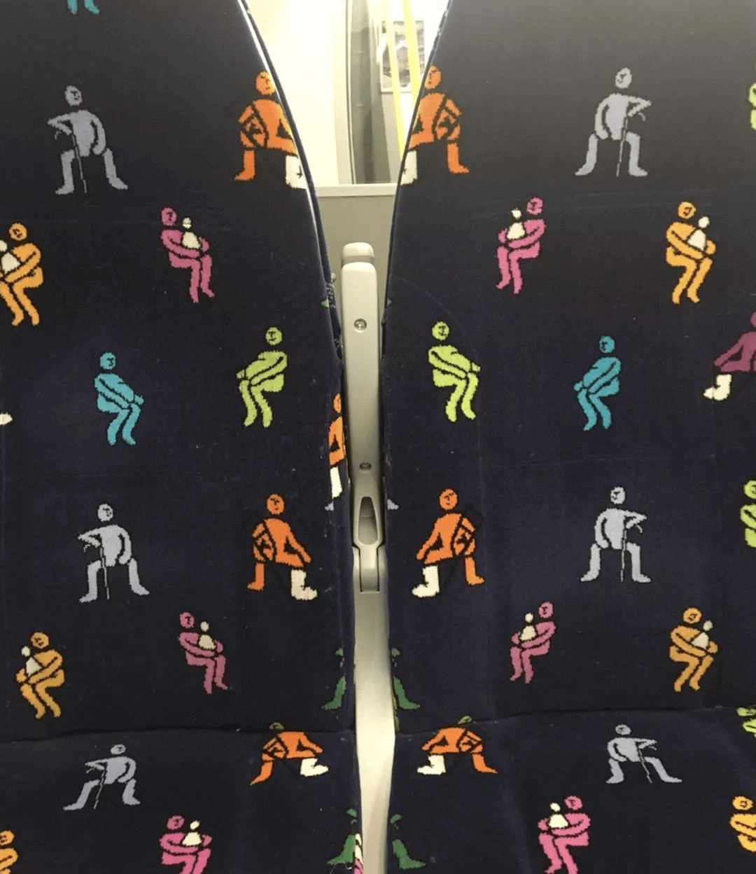
There are also graphic designs with obvious functionality, the most common of which is the priority seat. Scotrail's colourful seats feature silhouettes of various figures, with the orange figure in plaster cast, the grey figure on crutches, the blue and green figures for pregnant women, and the pink figure holding a baby. Although it was also criticized as "the image of a woman full of squatting pits", it is not dazzling, and the seat function is very clear.
3. Non-flat design
There are also public transportation seats in some cities, depicting real cities.
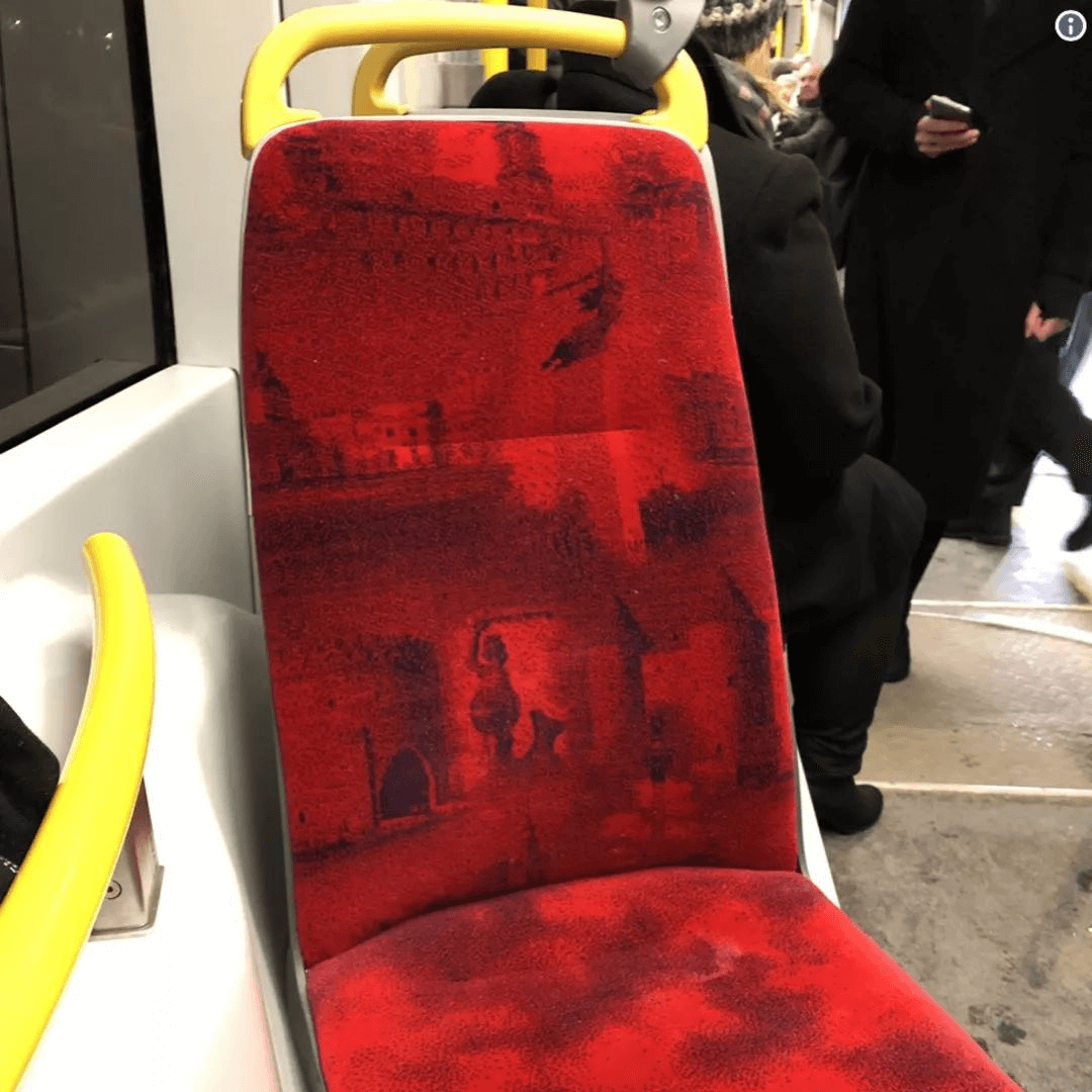
The seat covers of the Warsaw trams detail the city's former fortifications and are painted in blood red. Seats on Dublin's light rail show the city's monument that "looks like a Titanic sinking into the sea". These seat patterns with urban memory are still slightly heavy.
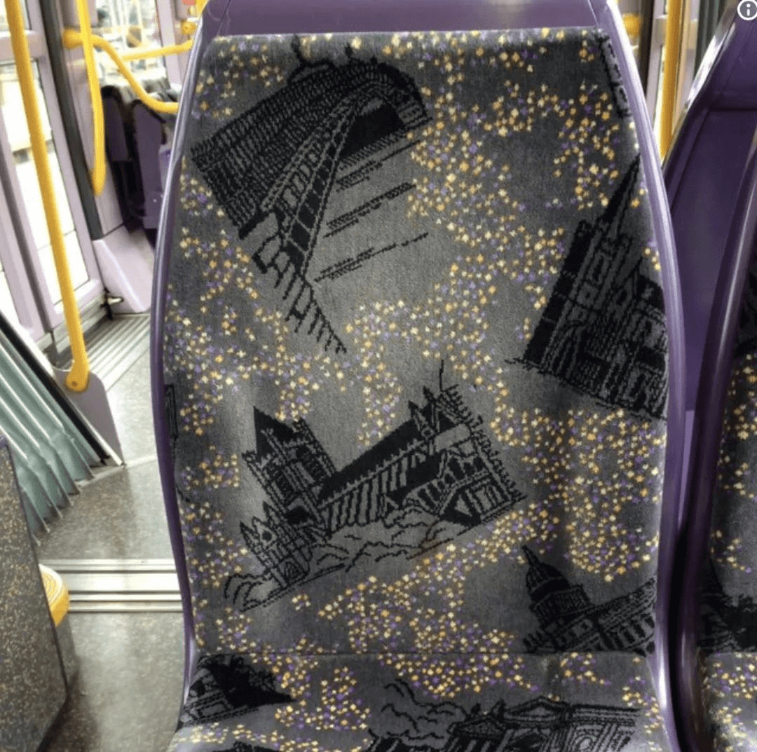
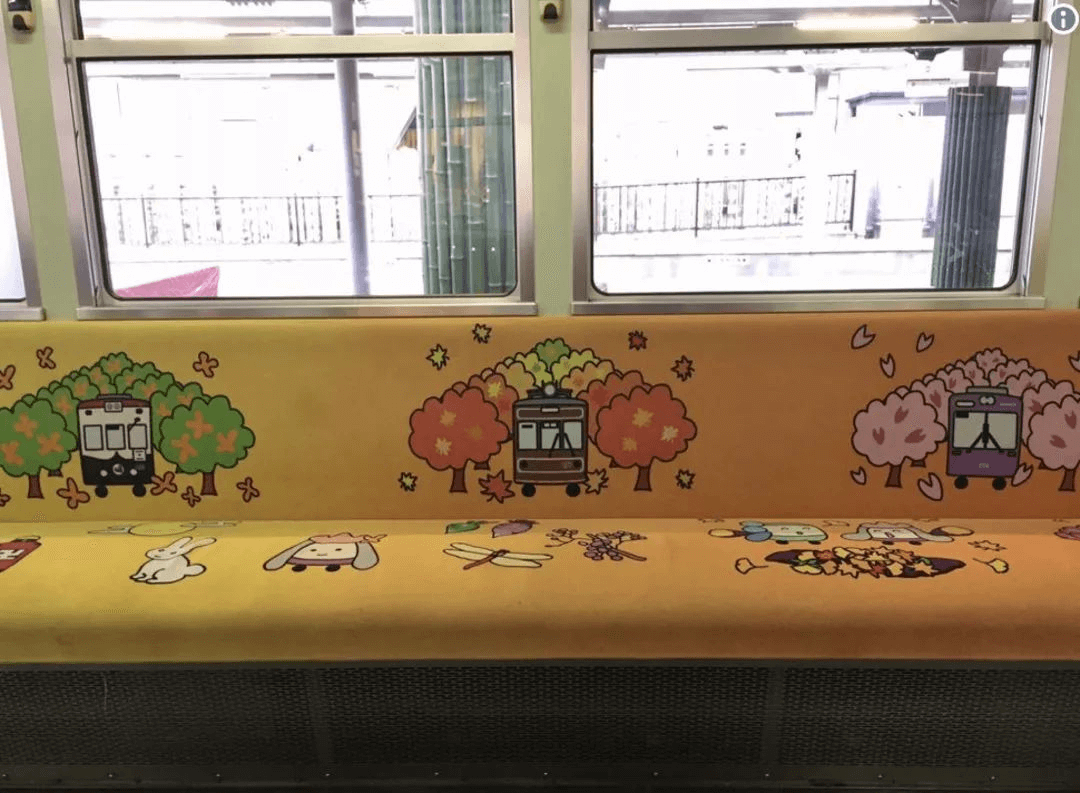
In contrast, the special-edition seats that Kyoto Metro once designed were much more brisk, depicting cartoon-style trains, trees and furry critters.
